A1 - How Did They Do It?
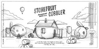
This is a packaging label for Almanac Beer Co., located in California (name is referring to the Farmer's Almanac). The purpose of the design is to show this company's pride of producing fresh fruit for their product. The context of the design is of a giant nectarine traveling from a farm on a seemingly warm day in California. DKNG Studios wanted to emphasize the company's use of produce, and decided that creating a larger than life, plump nectarine would be the way to go to showcase this. They also have hidden fruit in the label as well such as the sun and hot air balloon. The product itself is a fruit and spice filled ale that is reaching out towards 21+ adults that are into sour ales and like to buy from local companies. It's as if they are saying "Hey, drinking this is akin to having fresh fruit!" (but in an ale).
The designers went off of the description that the client had given the product and from there, brainstormed about three sketches to present. Once they were given the go-ahead then they start making a final draft along with warm colors that would create a fresh fall feeling.
DKNG
Initial sketches
"Fruit cobbler is a fruit-filled sour farmhouse ale bursting with baking spices. This brew showcases local Admiral Maltings Pilsner Malt and thousands of pounds of California-grown produce. After fermenting in oak barrels with our wild house culture, and a heavenly dose of vanilla, allspice, nutmeg, and cinnamon, the final blend has intoxicating aromas of fruit cobbler fresh out of the oven. Pair with sitting around the fire (or Yule Log channel), knitting, and holiday feasts."


